Success Story - Loan Payment
Moving loan payments from branches to digital.
Evolving the existing payment experience to reduce friction, improve financial understanding and increase digital adoption, connecting customer needs with business and portfolio goals.
- Starting point
- 67%
- Initial drop-off in the digital flow (representing only a 33% base adoption).
- Digital adoption
- 64%
- Digital adoption reached in the app.
- Target: 50%–60% · Achieved: 64% (from 33% baseline).
- TARGET EXCEEDED
- Portfolio impact
- 3.3%
- IMOR achieved after a -1.4% reduction.
- Over a 4.7% base IMOR rate (target: reduce 1%–3%).
- UX Strategy
- E2E Product Design
- Behavioral Design
- Product Analytics
- Role
- Product Designer / UX Strategy
- Scope
- Discovery → Strategy → Design → Validation → Delivery → Measurement
- Cross-Functional Collaboration
- Product Design, UX Research, Service Design, UX Content, Developers (iOS/Android), Tech Lead, Scrum Master, Business, Compliance and Legal.
- Product
- Financial App · Loan Payment
- Project type
- Evolution of an existing digital product
Project planning & milestones
Select each milestone to see the detail
Context
Loan payment was already available in the app. The challenge was not digitizing the service from scratch, but evolving an existing experience customers struggled to understand and adopt.
- Existing product: the flow worked, but did not drive mass adoption.
- Financial complexity: multiple concepts, payment scenarios and business rules increased cognitive load.
- Behavioral gap: despite a digital alternative, many customers still preferred branches for perceived certainty and control.
“The challenge was not making payments digital; they already were. The challenge was making digital payments understandable and valuable enough for customers to choose them.”
The Challenge
Research and product data showed that availability did not translate into adoption. 67% of customers who started the payment flow did not complete the transaction.
- Critical friction point: selecting the payment amount or concept created uncertainty and drop-off.
- Comprehension barrier: customers did not understand the financial consequences of each option.
- Trust barrier: the physical branch receipt acted as tangible evidence that the transaction was completed.
67%
Initial journey drop-off
Understanding
Difficulty understanding payment concepts
Trust
Physical confirmation reinforced reassurance
Adoption
Digital availability did not create digital behavior
Business Goal
The initiative connected customer experience with measurable business and operational goals.
- Digital adoption: increase digital payment adoption from a 33% baseline to a 50%–60% target.
- Portfolio impact: contribute to a 1%–3% IMOR reduction over a 4.7% base rate.
- Operational efficiency: reduce dependency on branch operations and their associated costs.
Digital payment adoption
IMOR
The opportunity was to create customer value and business value through the same product experience.
Discovery — Understanding the system before redesigning the interface
Discovery started by understanding the existing product: what worked, where friction lived, financial rules, technical constraints and behavior. Working closely with UX Research and stakeholders made it possible to connect user behavior with data and business priorities.
Research Objective
Identify the behavioral root cause of the 67% drop-off in the digital payment flow.
Hypothesis
We believe that by translating complex financial rules into clear consequences on the balance and providing an official digital receipt, we will remove cognitive friction and perceived risk, increasing baseline adoption from 33% to over 50%.
Methodology & Sample
Competitive benchmark, In-depth interviews, Concept tests and Incrementality test.
Total sample: n=80 app and branch users (50 qualitative interviews, 15 early concept tests and 15 iterative usability tests).
Key Insights
01 — Understanding
Customers did not always understand which payment option was right or what effect it would have on their loan.
02 — Availability ≠ Adoption
Making a feature available does not automatically change payment behavior.
03 — Tangible confirmation · Key Behavioral Design input
The physical receipt was more than information. It acted as tangible evidence that the transaction had been completed.
04 — Financial clarity
Customers needed the experience to explain the consequences of their decisions, not simply to read financial terminology.
Product Strategy — From a payment interface to a behavioral adoption strategy.
The strategy went beyond simplifying screens. The goal was to change the conditions influencing payment behavior.
- Behavioral adoption: design to reduce cognitive friction, not just click friction.
- Integrated inputs: combine data, financial rules, technical constraints and user needs into one strategy.
- Continuous measurement: connect every design decision to adoption, operational efficiency and portfolio impact metrics.
- 01UnderstandReduce financial complexity.
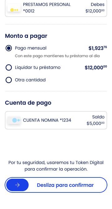
- 02DecideHelp customers understand what to pay and what each decision means.
- 03ActReduce the effort required to complete a payment.
- 04TrustProvide clear and persistent evidence of the transaction.
- 05RepeatUse contextual reminders to encourage the digital habit.
- 06ConnectRemove barriers between payment and other capabilities.
Key Design Decisions
Ideation Leadership & Tools
Workshop Leadership
Direct facilitation of co-creation sessions with technical and business stakeholders. Use of How Might We (HMW) and Crazy 8s dynamics to ideate technically and legally viable solutions.
AI Integration
Use of Large Language Models (LLMs) as a copilot to accelerate qualitative synthesis and microcopy.
Principles & Accessibility
Application of Nielsen Heuristics and compliance with the Web Content Accessibility Guidelines (WCAG) 2.1 AA.
System Consistency
100% built on Design System tokens and institutional Voice & Tone guidelines.
Decision 01
Simplify financial decisions
Problem
The experience exposed customers to multiple financial concepts.
Decision
Reduce and prioritize the key decisions:
- Payment to avoid interest
- Pay off loan
- Other amount
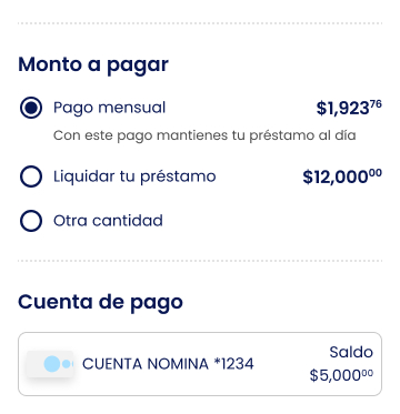
Rationale: Customers should not have to understand the internal complexity of a financial product in order to pay.
“We did not remove the complexity of the financial product. We prevented customers from having to manage it themselves.”
Decision 02
Explain consequences, not just amounts
Problem
Selecting an amount did not necessarily help customers understand what that payment would do.
Decision
Use dynamic explanatory content based on the selected or entered amount. The interface explained what the payment covered and how it affected the customer's loan where applicable.
From
“How much do you want to pay?”
To
“If you pay this amount, this is what happens with your loan.”
Decision 03
Design around context and intent
Reminder
Home → Reminder banner → Relevant loan payment
Product
Home → Loan Product card → Loan detail → Pay
Feature
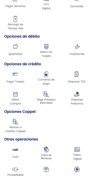
Home → Actions menu → Pay Loans → Select loan when multiple loans exist
The experience adapted to the user's context instead of forcing a single navigation path. When the reminder acted as the entry point, the journey could take the customer directly to the relevant loan and payment action.
Decision 04
Remove friction outside the ecosystem
Problem
Customers could hold the money needed for the payment at another financial institution.
Decision
Provide a secondary “Pay from another bank” option. The experience provided:
- CLABE associated with the loan
- Amount information
- Clear SPEI transfer instructions
- Expected payment application information
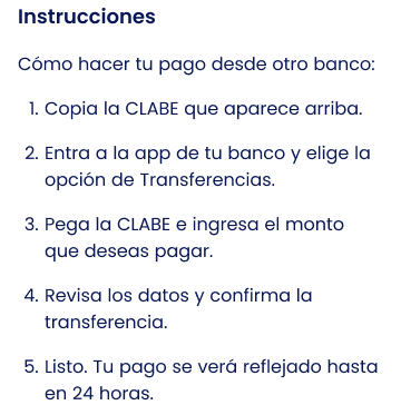
Solving the payment flow required looking beyond internal screens.
Decision 05 · Key Behavioral Design decision
Turn physical reassurance into digital trust
Research finding: customers paying in branches valued having a tangible receipt confirming the transaction.
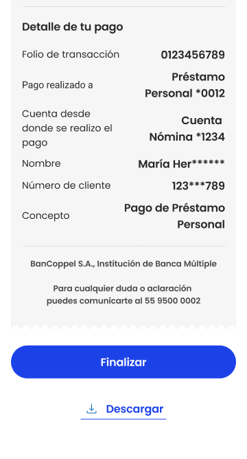
Decision: create an official, persistent digital receipt.
- Operation number / reference
- Date and time
- Amount
- Loan information
- Source account
- Payment information
- Relevant post-payment information
- Download
- Share
- Future access through loan transactions
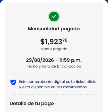
“Instead of asking customers to simply trust the digital channel, we translated an existing source of reassurance into the experience.”
Decision 06
Design for repeated behavior
The goal was not only to complete a digital payment, but to make digital payment progressively easier to repeat.
Trigger (Reminder)
Payment reminder roughly three days before the due date
Action
Direct access to the relevant payment journey
Reduced friction
Relevant payment option + short journey
Feedback
Immediate transaction confirmation and digital receipt
Repetition
Next payment cycle
Direct debit existed in the ecosystem as an adjacent capability.
E2E Experience — Complex financial rules. One simple customer journey.
Happy Path — Main flow
- 01
Entry
3 entry points: Banner, Loan card or Home menu.
- 02
Understand and decide
Amount selection and dynamic visualization of the impact on the balance.
Alternative path
Pay from another bank
CLABE copy and SPEI instructions.
- 03
Confirm
Secure authentication of the operation with a high-level token.
- 04
Pay and trust
Processing and generation of the official digital receipt (persistent ticket).
- 05
Follow-up
Download, share and future access through transactions.
Validation & Delivery
The role continued from discovery through post-launch measurement. Regulatory, business and technical constraints were treated as design inputs, not as predefined solutions.
Regulatory, business and technical constraints were treated as design inputs, not as predefined solutions.
User validation
Moderated Qualitative Testing
Prototype evaluation with branch and app users. 90% of participants understood the financial impact of their payment in under 10 seconds once the concepts were simplified.
Design iteration
Feedback-driven Refinement
Added a prominent confirmation reference number and quick download to the digital receipt, after identifying that proof-of-payment certainty was the main trust barrier.
Design → Engineering
DesignOps & Experience QA
Documented edge cases and business rules in Figma. Direct support during development sprints to ensure mathematical accuracy in the interface and visual consistency.
Measurement — Measuring behavior, not just delivery.
Success was assessed by connecting the experience with changes in digital behavior and operational efficiency.
Post-launch monitoring scheme (early 2026)
Phase 1 — First quarter
Monthly review of the conversion funnel to identify early friction with real data.
Phase 2 — Maturity
Evaluation of cumulative impact 3 months after launch to validate the sustainability of adoption (+64%) and IMOR reduction (-1.4%).
The goal was not simply to ship a flow, but to understand whether we were changing customer behavior.
Impact
Adoption starting point
67%
Initial drop-off caused by cognitive friction (33% base adoption).
Adoption result
64%
Achieved: 64% (Target: 50%–60%).
TARGET EXCEEDED
IMOR starting point
4.7%
Initial portfolio delinquency rate.
IMOR result
3.3%
Achieved a -1.4% reduction (Target: 1%–3%).
TARGET MET
The initiative showed how reducing behavioral friction in a financial flow drives digital adoption and contributes to business outcomes.
Learnings
- 01
Availability does not create adoption
Designing requires understanding behavioral barriers.
- 02
Design for user and business value
UX decisions influence adoption and operational efficiency.
- 03
Constraints are inputs
Understanding why a rule exists makes it possible to collaborate strategically without adding complexity for the user.
“This project changed how I approach Product Design: from designing interfaces that work, to designing systems that influence behavior, support business goals and can be measured after launch.”
Erick Meneses — Success Story - Loan Payment